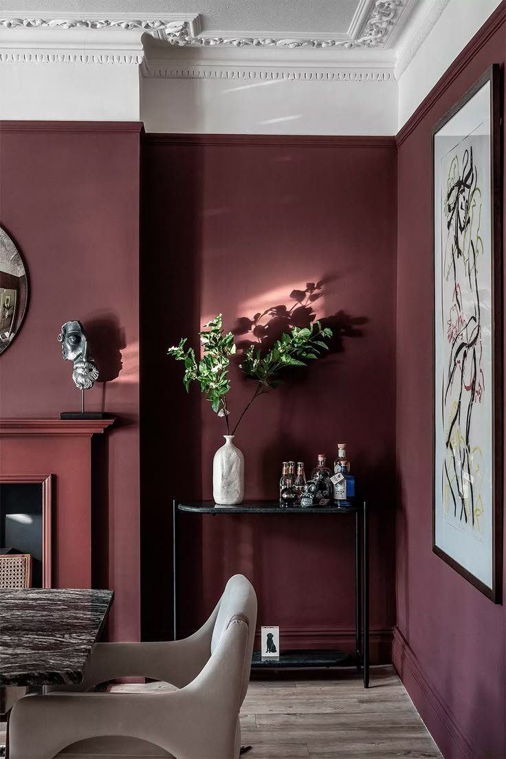
Burgundy paint colors are a timeless choice for creating rich, warm, and inviting spaces. Whether you’re looking to make a bold statement or subtly enhance your room, burgundy hues offer a deep, sophisticated aesthetic that works in any room. From deep, wine-inspired shades to lighter, more muted tones, burgundy paint colors can be used in various ways to suit your personal style. In this guide, we’ll explore the best burgundy paint colors, how to incorporate them into your home, and how to pair them with other hues for a harmonious and visually appealing result.
Why Choose Burgundy Paint Colors?
Burgundy paint colors have a unique way of transforming a room into something cozy, elegant, and vibrant. The richness of burgundy brings depth to a space while creating an atmosphere of warmth. It’s not overpowering but still packs enough visual interest to make a bold impact.
Burgundy is often associated with luxury, sophistication, and romance, making it a great choice for areas where you want to create a dramatic flair. It’s also versatile enough to be paired with both modern and traditional decor styles. Whether you’re using burgundy on an accent wall or as the main color in a room, its versatility allows it to fit into a variety of themes.
Burgundy is also a color with a history. It has long been associated with aristocracy and fine wines, adding a touch of class to any interior. Its richness and deep tones can make a room feel cozy and inviting, while still being bold and captivating. Let’s dive into some of the best burgundy paint colors and how to use them effectively.
- Benjamin Moore – New London Burgundy

This shade of burgundy is deep, rich, and sophisticated. New London Burgundy is perfect for spaces where you want to create a sense of warmth and intimacy. Its balance between red and brown makes it ideal for dining rooms, living rooms, and even entryways. The tone is bold but not overpowering, giving your room a luxurious, traditional feel. Pair it with warm wood tones and gold or brass accents for a truly regal look.
2. Sherwin-Williams – Rookwood Red

Sherwin-Williams’ Rookwood Red is a dark and earthy burgundy paint color that adds richness to any room. It has an understated elegance, making it an excellent choice for spaces like libraries, home offices, or even bedrooms. This burgundy paint color works especially well with neutral colors like beige, taupe, or ivory to balance its depth. When paired with classic wood furniture or modern metallic accents, Rookwood Red can create a space that feels both timeless and sophisticated.
3. Sherwin-Williams – Fine Wine

Fine Wine (SW 6307) by Sherwin-Williams is a deep, elegant burgundy with warm undertones, perfect for adding richness and sophistication to any space. This bold yet inviting shade works beautifully on accent walls, dining rooms, and cabinetry, creating a cozy and luxurious atmosphere. Pair it with soft neutrals, warm golds, or deep grays for a balanced and stylish look. Whether used in traditional or modern designs, Fine Wine brings timeless charm and depth to interiors.
4. Behr – Rumors

Behr has announced “Rumors” (MQ1-15) as its 2025 Color of the Year. This deep, dynamic ruby red is designed to add warmth and rich allure to any space. According to Erika Woelfel, Behr’s Vice President of Color and Creative Services, “Rumors is a modern take on the timeless red that creates an energetic appeal to make a lasting statement in a stunning way.”
Incorporating “Rumors” into your home can create a bold yet elegant atmosphere. It pairs well with neutrals like white and natural wood finishes, offering versatility across various design styles. This shade is suitable for accent walls, kitchen cabinetry, dining rooms, and even exterior applications like front
5. Backdrop – SELF-PORTRAIT

SELF-PORTRAIT” by Backdrop is a deep, dark red paint color that brings a rich, sophisticated ambiance to any interior space. This premium acrylic paint is formulated for high durability, low odor, and low volatile organic compounds (VOCs), ensuring a safer and more pleasant application experience. It features a semi-matte finish with a 6% sheen, offering a subtle, elegant look on your walls. The paint is designed for easy application, quick drying times, and superior coverage, making it a convenient choice for both DIY enthusiasts and professionals.
“SELF-PORTRAIT” is available in various sizes and finishes, including options suitable for interior walls, cabinets, and doors. Its deep red hue adds a touch of luxury and warmth, making it an excellent choice for accent walls, dining rooms, or any area where you desire a bold yet refined statement.
6. Sherwin-Williams – Burgundy

Simple yet impactful, Sherwin-Williams’ Burgundy is a bold, classic burgundy paint color that adds depth to any room. Whether you use it on an accent wall or throughout an entire room, this hue will create a welcoming and dramatic effect. Burgundy works well in spaces like living rooms, bedrooms, and dining areas, where it helps to create a warm, intimate setting. Pair it with soft neutrals like gray or ivory for balance, or go bold with metallic accents in gold, brass, or copper for an elevated touch.
7. Benjamin Moore – Bewitched

Bewitched (CSP-450) by Benjamin Moore is a fluid oxblood red, beguiling in its depth of tint. Bewilderingly harmonic, let it cast its spell over you.
This rich, moody shade dances between deep charcoal and soft black, adding depth and sophistication to any space. Ideal for bedrooms, studies, and living rooms, Bewitched creates a luxurious atmosphere that invites relaxation and introspection. Pair it with warm metallic accents and plush textiles to enhance its allure. Let Bewitched be the enchanting backdrop that transforms your home into a sanctuary of refined comfort.
8. Benjamin Moore – Fading Twilight
Benjamin Moore’s “Fading Twilight” (1258) is a deep, muted red with balanced undertones, making it a versatile choice for various design styles. Its Light Reflectance Value (LRV) is 14.34, indicating it absorbs lighter than it reflects, contributing to its rich and dramatic appearance.
This color is part of Benjamin Moore’s Classics® collection and is also known by the code HC-66. It’s described as capturing the essence of the last light in a mountain sky, offering a deep and dramatic hue. Pairing it with richly textured fabrics and creamy accents can create a sumptuous and inviting look.
9. Sherwin Williams – Sommelier

Sherwin-Williams’ “Sommelier” (SW 7595) is a deep, rich burgundy hue that exudes sophistication and warmth. This luxurious color pairs beautifully with neutrals like SW 7008 Alabaster and SW 7036 Accessible Beige for a classic look. For a more daring combination, try incorporating SW 6258 Tricorn Black or SW 6184 Austere Gray to create a striking contrast. Whether used as an accent wall or throughout a space, Sommelier adds depth and warmth, making it a versatile choice for a variety of interior styles. The Light Reflectance Value (LRV) of Sommelier is approximately 5.3, indicating it absorbs most light and contributes to a cozy, intimate atmosphere.
10. Paint and Paper Library – Grenache

Paint & Paper Library’s “Grenache” (No. 372) is an intimate and rounded deep red paint color. This hue offers inherent warmth, making it an excellent choice for living spaces and hallways. It pairs exceptionally well with soft greys, such as “Salt” and “Drakensberg” or “Perse Grey,” to achieve a balanced interior.
Applying “Grenache” to walls, skirting, and trims creates a bold and compelling scheme. This color works beautifully with dark wood and lustrous accents, adding timeless luxury to spaces like kitchens. It pairs beautifully with gold accents.
Incorporating “Grenache” into your design can add a sense of warmth and sophistication, creating a cozy yet elegant atmosphere in your home.
11. Deep Reddish Brown by Farrow & Ball

Farrow & Ball’s “Deep Reddish Brown” (No. W101) is a rich, earthy color that adds warmth and sophistication to interiors. Once popular in country houses, it’s now a timeless choice for both traditional and contemporary designs. Best for walls, doors, and trim, it pairs well with Farrow & Ball’s Red & Warm Tones Primer & Undercoat. Available in finishes like Estate Emulsion, Modern Emulsion, Estate Eggshell, and Full Gloss, it offers versatility for different surfaces. Apply with high-quality brushes or rollers for best results.
12. Claire Paint – Vintage

Clare’s “Vintage” is a deep, muted burgundy that adds a touch of warmth and sophistication to any space. Perfect for walls, doors, or trim, this versatile color works beautifully with neutral tones or bolder accents to create a balanced and inviting atmosphere. Its rich, elegant tone is ideal for spaces like living rooms, dining areas, and bedrooms, helping to establish a cozy, intimate vibe. Available in Clare’s premium, zero-VOC matte finish, “Vintage” delivers both style and sustainability, making it a timeless choice for various interior designs.
13. Reference Red by Farrow & Ball

Farrow & Ball’s “Preference Red” (No. 297) is a deep, rich burgundy paint color that adds elegance and warmth to any space. Ideal for walls, trim, and cabinetry, it brings sophistication with its Baroque-inspired tone. Available in finishes like Estate Emulsion and Modern Emulsion, it pairs beautifully with neutrals like “Joa’s White” for a balanced palette. Perfect for creating focal points in living rooms, dining areas, or bedrooms.
How to Use Burgundy Paint Colors in Your Home
Burgundy paint colors can be used in a variety of ways to enhance the look of your home. Here are a few ideas for incorporating these rich, warm hues into your space:
- Accent Walls: One of the best ways to incorporate burgundy paint colors is by using them for accent walls. Burgundy provides a striking contrast to neutral tones, helping to create a focal point in any room. Pair it with soft beige, white, or gray for a balanced look.
- Dining Rooms: Burgundy is a great choice for dining rooms. It adds warmth and elegance, making it perfect for creating a cozy atmosphere. Pair it with dark wood furniture and metallic accents for an added touch of luxury.
- Bedrooms: Burgundy paint colors can make a bedroom feel cozy and inviting. Try using a deep burgundy like Cabernet Sauvignon or Burgundy Wine on the walls to create a relaxing, intimate space. Add soft fabrics like velvet throw pillows and luxurious bedding for extra comfort.
- Living Rooms: Burgundy can work wonders in living rooms, where it helps create a welcoming environment. Whether you use it as the primary color or on an accent wall, it adds sophistication without being too overwhelming. Pair it with soft neutrals and rich textures like leather or velvet to elevate the space.
- Home Offices: If you want to create a space that’s both inspiring and warm, burgundy is a fantastic choice. Use it to create an environment that encourages focus and creativity. Pair it with light-colored furniture and unique accents like a vintage globe or bookshelves.
- Entryways: Burgundy paint colors are perfect for entryways, where they create a bold first impression. A rich shade like Rookwood Red can help set the tone for the rest of your home. Pair it with antique furnishings, brass fixtures, and soft lighting for an elegant touch.
Burgundy paint colors offer a wide range of possibilities for creating rich, inviting spaces in your home. From deep, wine-inspired hues to more muted, earthy tones, there’s a shade of burgundy for every room. Whether you’re looking to make a bold statement or create a cozy atmosphere, burgundy is a versatile and timeless choice. So go ahead—transform your home with one of these stunning burgundy paint colors and let your space radiate warmth and sophistication.